Scene 2: Brand Logo
Do we need to learn prompt words?
After understanding the basic prompts in the previous chapter, this chapter will teach you more vertical scenario prompts.
Regarding vertical scenarios, I have seen a lot of tutorials and sharing that share various prompt words related to logos such as:
- modern
- minimalist
- vintage
- cartoon
- geometric
To be honest, when I was learning how to use Midjourney, I initially thought that as long as I looked at other people's prompts and used their prompt words, I could generate good images.
But for beginners, I do not recommend memorizing templates or these words directly.
Because what you lack in writing a good prompt is not just prompt words but also an understanding of design and even imagination.
For example, in this chapter on logo design if you don't know which elements are included in a logo or what style it should be suitable for then no matter how many prompt words you understand it won't help generate satisfactory logos.
As mentioned earlier in my Midjourney tutorial series unlike ChatGPT which is declarative where you can even make it play a certain role;
Midjourney is directive where you can only use instructions to draw the image that you imagine. It's okay to study these words after being able to produce stable output.
For ordinary people like us, what really hinders us may not be learning these vocabulary terms but rather our aesthetic sense.
Common Brand Logos
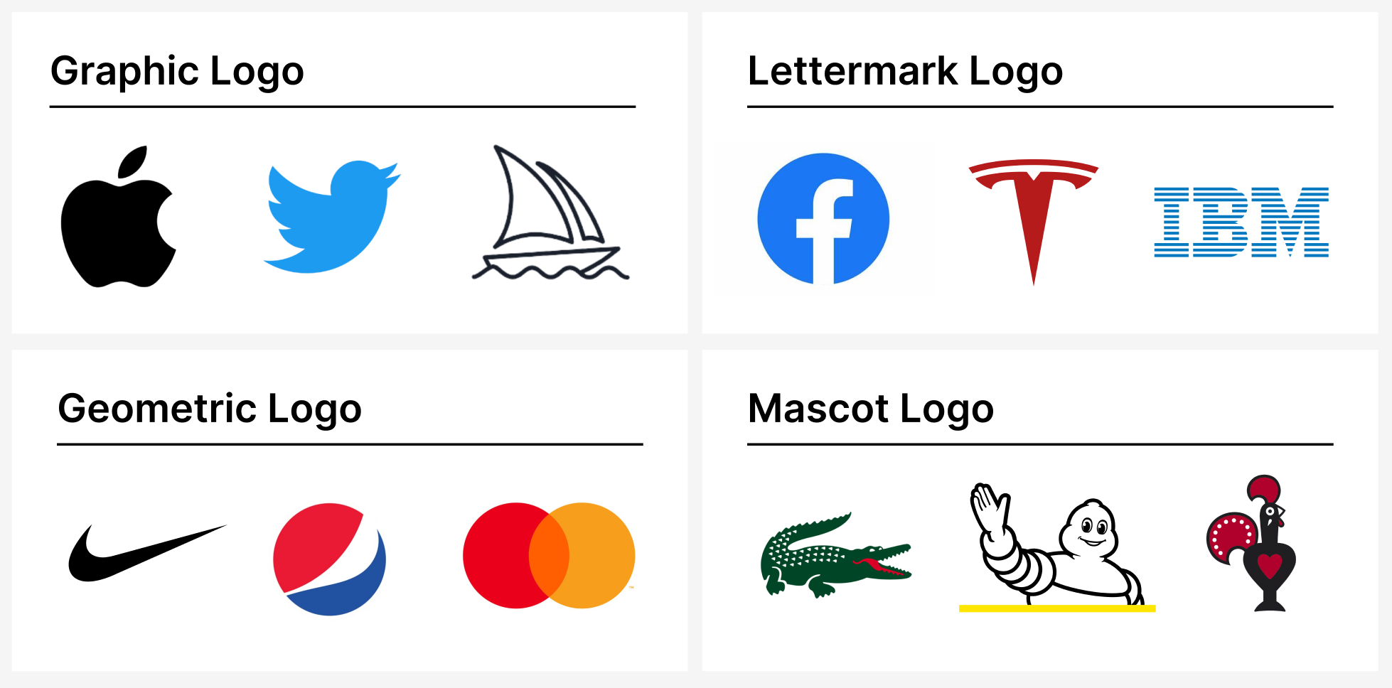
Common brand logos are generally divided into the following four forms:
- Graphic Logo: Generally based on graphics, like Apple, Twitter and Midjourney.
- Lettermark Logo: Generally using the first letter of the company name as the main body of the logo, such as Facebook, Tesla and IBM (IBM's full name is International Business Machines).
- Geometric Logo: A logo composed of geometric shapes, such as Nike, Pepsi-Cola and Mastercard.
- Mascot Logo: Relatively rare logos that use a company mascot as their design element. For example, Michelin's logo features a tire man mascot while my favorite grilled chicken restaurant Nando's has a 🐔as its mascot.
In fact, there is another type of common brand logo which is a combination of text and one of these aforementioned types.
For example,Tesla’s complete logo consists of Tesla plus a T. However, Midjourney has many issues with generating text so it will not be discussed in this chapter.
Graphic Logo
When you want to use AI to generate a logo, I suggest that you choose a direction that you approve of and then let the AI create it.
First, let's analyze the characteristics of a Graphic Logo:
- Logo type: graphic logo
- Logo graphic description: for example, a cat
- Style: Mostly designed in flat style Mostly vector graphics Simplicity is key
Based on these characteristics, the core of creating an effective prompt is to clearly describe the desired style.
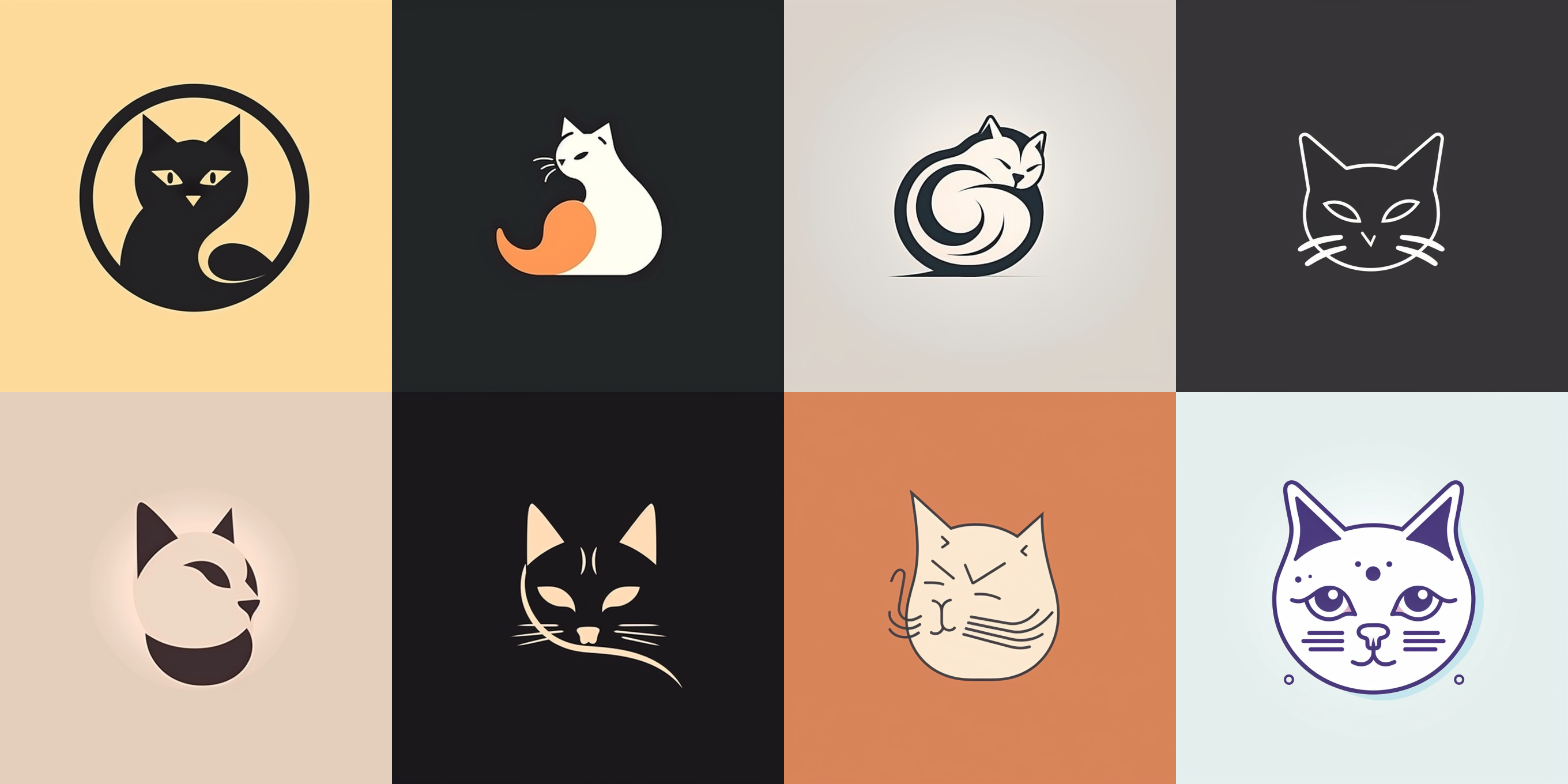
flat vector graphic logo of cat, simple minimal
Another common design for graphic logos, such as the Midjourney logo in the previous example, is to simply add a line after the graphic:
flat vector graphic line logo of cat, simple minimal
The following 4 on the left are the versions without the line:
Lettermark Logo
According to my experiments and trying out prompts written by many people, my personal feeling is that this type of logo looks simple with just one letter being transformed.
However, when AI generates it, the effect is mediocre.
Also, there's an interesting discovery that logos made with the letter A have better quality than those made with other letters (not strictly based on data statistics but only personal perception).
This type of logo has the following characteristics:
- Logo Type: Lettermark
- Logo Graphic Description: Purely alphabetic Font Style: Can add preferred font as needed
- Style:
- Vector-based
- Simple minimalism
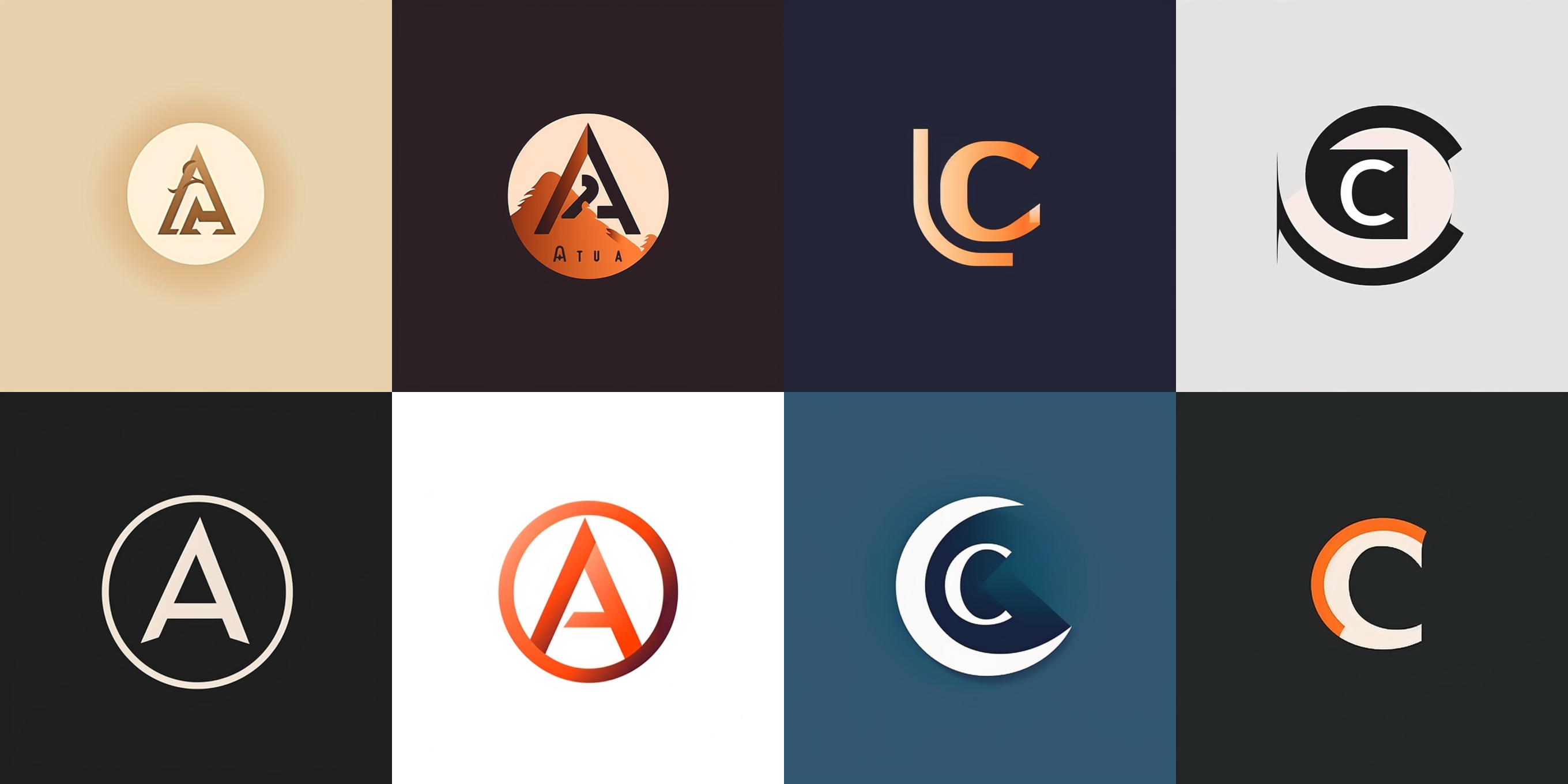
Based on these features, a prompt can be written (the generated logos are for letters A and C; I personally feel that the A logo is much better).
Additionally, it should be noted that this example actually illustrates how syntax is not important in Midjourney - unlike other types of lettermarks where syntax requirements must be followed such as writing "lettermark logo of letter A".
letter A logo, lettermark, typography, vector simple minimal
Geometric Logo
This type of logo is relatively speaking, although only graphics, but there are many ways to play, introduce two common ways to play:
- Loop Repeat
If you are using an iPhone, you can take a look at the logo of the photo application in iPhone, which is also a Geometric Logo, and it is an elliptical graphic rotating and repeating, and finally combined into the shape of a flower. To break it down, the key words are
Logo type: geometric logo
Logo graphic description:
Rotation and repetition: radial repeating
Style: simple minimal
Simple: simple minimal
Let's write a similar prompt:
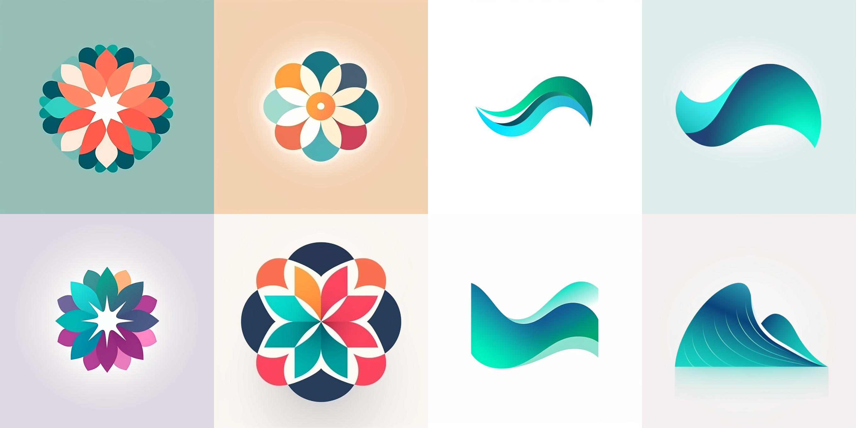
Flat geometric vector geometric logo of flower, petals radial repeating, simple minimal
- Gradient
Another common gameplay is gradient color.
If you are using the Edge browser on your computer, take a look at its logo, which is a gradient color with a wave-like appearance.
Breaking it down, the keywords are:
Logo type: geometric logo;
Logo image description:
curved wave shape;
Blue-green gradient;
Style: simple and minimal.
Let's write a similar prompt:
Flat geometric vector graphic logo of curved wave shape, blue green gradient ,simple minimal
The final generated results look like this, I really like the third of the flowers and the second of the waves::
Mascot Logo
This type of mascot logo, I think, is the style of logo that Midjourney is best at.
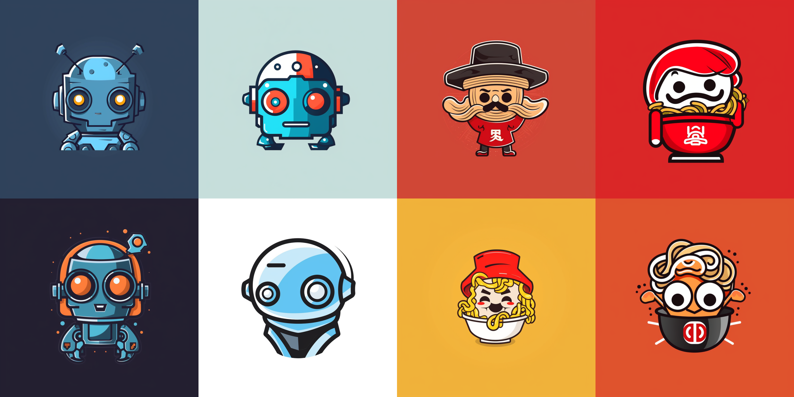
Let's write a Mascot logo for a robotics company and break down the prompt keywords:
- Logo type: mascot logo
- Logo description: e.g. robot robot
- Style: simple
prompt:
a mascot vector logo of a robot, simple
And what happens when a mascot is created for a noodle company:
simple mascot logo for a Instant Noodles company
Here are the results, I like the logo of the noodle company:
Tip 4: Adding Style - Artistic Movement
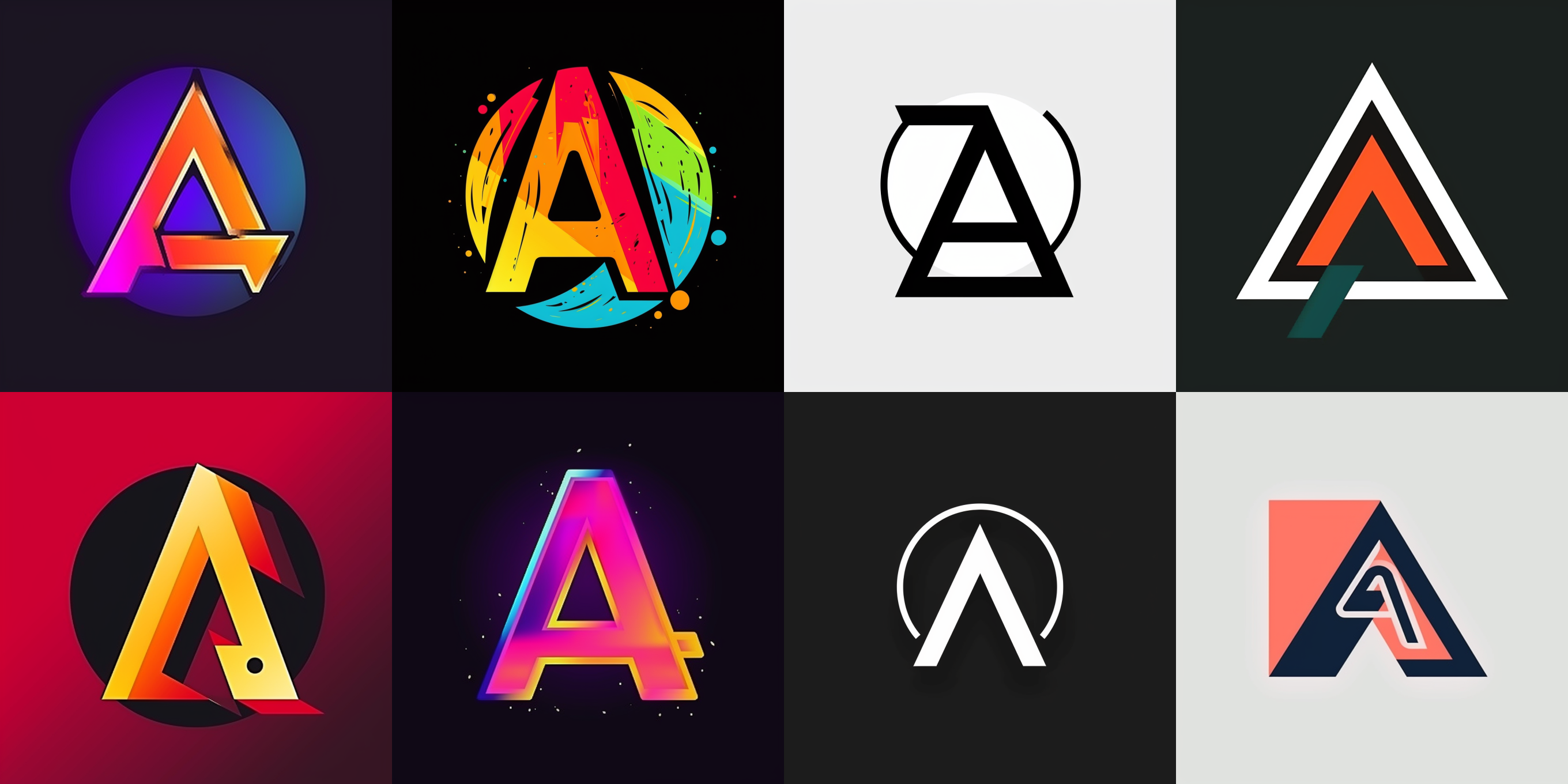
The reason for this is not that Midjourney is not strong, but that we have given too few instructions, as long as we add a few words to the prompt, we can generate a different logo: the prompt of the four on the left looks like this, I just added two words to the original prompt Pop Art:
letter A logo, lettermark, typography, vector simple, Pop Art
What is Pop Art?
Pop Art is an art movement that originated in the 1950s and 1960s. It emphasizes reflection and expression of mass culture, mass media, and consumerism.
The term "pop" comes from "popular art," which was coined by British art critic Lawrence Alloway in 1956.
The characteristics of Pop Art are:
- Its subject matter generally consists of common objects and images found in everyday life such as advertising slogans, magazine covers, food packaging etc.
- Bold colors are often used with simple lines to emphasize the visual effect and meaning of the object itself.
The prompt on the right mentions De Stijl
letter A logo, lettermark, typography, vector simple,De Stijl
What is De Stijl?
It is a Dutch art movement that began in 1917, dedicated to simplifying visual elements including straight lines, planes and primary colors.
Its members include painters such as Piet Mondrian and Theo van Doesburg. Members of De Stijl were committed to integrating art with design to create an aesthetic that was both practical and functional.
The characteristics of De Stijl are:
Frequent use of geometric shapes in design, such as rectangles and straight lines.
Use of only primary colors for color schemes, such as black, white, gray, red, yellow and blue.
Pursuit of balance and harmony while emphasizing form and structure over detail or expressiveness.
After reading this introduction about the movement's characteristics, take another look at Midjourney's logo - can you see the influence?